Clarity,
Office 17622,
PO Box 6945,
London.
W1A 6US
United Kingdom
Phone/ Voicemail:
+44 (0)20 3287 3053 (UK)
+1 (561) 459-4758 (US).

Grace, that is brilliantly helpful, thank you. It shows me exactly where the problems are, I can make a list and go and look for help with them.
A question: on the home page, you had horizontal scrolling (argh) before you clicked 'mobile site' at the bottom. (That shouldn't happen; it should detect your screen size and adjust automatically.) Does that also happen on other pages eg a blog post or http://www.onlineClarity.co.uk/learn ? Or do they work right from the start?
Do you know what your screen resolution is?
And is the menu behaving itself? It should become 'mobile friendly' at least to the extent that things appear when you tap them and you follow links by tapping twice. (I found that worked politely in Chrome on my tablet, but not in more obscure browsers.) Something you said earlier about not being able to access one menu item because another started popping up made me think it might not be.

Funny story.
..'
") )
)
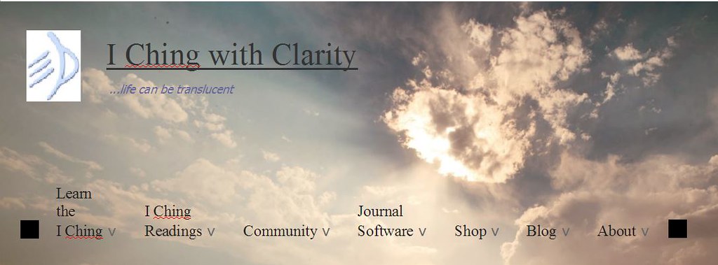
I am now in the awkward position of having had my husband re-edit the image for the header/footer, so the sun is over on the right and out of the way of the menu text... and then having LiSe say very definitely that it looks much better the way it is. Question for the oracle: 'How can I please all the people, all the time?'Okay, yes, so not bold then. There could be a lot of options...bigger might do it, unless it'd run out of space horizontally. I like the background image & would hate to see it faded too much - I don't think it's too bright per se, if the headings could be tweaked. Hard to say without experimenting.
I'm not kidding, though, for a millisecond when I first opened the site this morning I wondered why there was a vast empty banner on top, then realized it wasn't empty at all.
I do think the site title would benefit from being quite a bit more conspicuous. Larger, maybe in italics (though maybe I'm still just used to seeing the old one in italics), maybe in one of the lighter colors pulled from the clouds, maybe a different font...no one wants a site with ten fonts on every page, but a couple would be fine, I think.
I suppose it could just not be in italics? It'd still be in a grey box, after all, so perfectly clear. I'll put that on the list.Speaking of fonts - I really like the new post font (again, nothing against our friend Trebuchet, who I started using in real life after meeting him here
But - the font in the post quote boxes, not as lovely. IMO it's too small, not crisp like the main post font, and the line spacing is a bit too great. Maybe another half a point in size or so would fix all of that at once? Maybe the italic version of whatever-font-it-is just isn't very well done? Don't know.
Also the font in the Quick Search box seems a bit tiny.
And that's different from 'latest posts'?? I'm lost.There was also an option "Latest started threads" or something. I certainly didn't use them all the time, but they were nice to have.
Ignore. I'm being stupid.Now it seems that logging in to the site in the normal way doesn't log you into the forums.
...blah blah blah...
Well, the thing is, the reason we have our browsers set up with such a high zoom is because we can't read the tiny font sizes that come with new technology. We shouldn't HAVE to set our browsers to 175% just so we can read comfortably and the websites shouldn't REQUIRE us to change our own comfort habits in order to view them properly.
I've tested it now on Microsoft's own browsers as well, I hope it shows what I mean.
(you will get a pop up advert with this link, but it's a completely free video upload which is helpful in terms of not wasting one's Gb allocations
If you could use one at this point -
(Or maybe a nap.)
I like the bigger headings!
(And please ignore my last post :bag: - when it appeared not to submit, I decided why am I being so nitpicky when I really do like the new site. And then it submitted anyway. Will shut up and just enjoy the atmosphere now... )
Well, the thing is, the reason we have our browsers set up with such a high zoom is because we can't read the tiny font sizes that come with new technology. We shouldn't HAVE to set our browsers to 175% just so we can read comfortably and the websites shouldn't REQUIRE us to change our own comfort habits in order to view them properly.
I've tested it now on Microsoft's own browsers as well, I hope it shows what I mean.
(you will get a pop up advert with this link, but it's a completely free video upload which is helpful in terms of not wasting one's Gb allocations
So I cannot find any old threads of mine. I will go and see if I can find latest postsEr 'we' at least I don't have our browsers set up with a high zoom and I have never ever needed 175% so I think this is your particular problem. The font is the perfect size for a 100% well it was but now to me it seems rather too large presumably because you said it was too small. Has it been made larger because of what PG said Hilary ?
Can we go back to the usual size ? Just joking...but it wasn't too small to start with as far as I was concerned.
Oh dear went to my profile and clicked on 'latest posts' and there were only 3 there.
I hope this function can be fixed as it is one I use a lot to find things
I can't quite see, but isn't the font on the website about the same size as the fonts in the native menus for the tablet? More or less?
Ah - er - sorry - that information's lost. Database corruption, impossible to post messages, and that was the table that had been corrupted. So the price of getting a functional forum was losing the 'latest posts' list.
However it may be possible to regenerate it - or it may regenerate itself given time. I'm not inclined to go and actively seek to re-build the search index just now. Let's give it a few more days to check something like that wouldn't break the website. (Again.)
I am now in the awkward position of having had my husband re-edit the image for the header/footer, so the sun is over on the right and out of the way of the menu text... and then having LiSe say very definitely that it looks much better the way it is. Question for the oracle: 'How can I please all the people, all the time?'
(I can certainly make the font 20px instead of 18px, though. I'm pretty sure that will still fit on the page horizontally.)
, the banner looking PERFECT (at least to me), and then the perfection disappeared somewhere, so I can't make a screen clip to show you.lisa said:...the font in the post quote boxes, not as lovely. IMO it's too small, not crisp like the main post font, and the line spacing is a bit too great.
hilary said:I suppose it could just not be in italics? It'd still be in a grey box, after all, so perfectly clear. I'll put that on the list.
hilary said:Err... what box is that, where? Help?
And that's different from 'latest posts'?? I'm lost.
I also love the banner image the way it is and do not want it changed. What I think looked perfect was when the menu headings font was the size that caused "About" and "Search" (the magnifying glass) to go onto a second horizontally-centered row. Having two rows looked fine, I thought, because it was centered, and I thought that one simple change solved everything about the banner. Being larger made it automatically darker (without using up the "bold" attribute) - I thought the size worked well with the site title - and, being on two rows, it filled and balanced the banner space nicely.
Click on the magnifying glass in the menu, type in the "Quick Search" box.
[Edited] Actually now when you type in that box the letters seem the same size as everything else, that is, not tiny. Either you changed it, or I really am delusional...

I won't actually lose sleep over it, but will try to remember the urls for those and put them back one of these days. Today's task, though, is what I'd planned to do on Saturday: fix the Amember-generated pages.In the old search menu there were several options. Activity Stream was a live feed of posts that updated itself, sort of like Twitter. Latest Posts showed new posts. Latest Started Threads showed new threads (instead of new posts). Different focussed views of the information, is all. Sometimes nice to have; not essential. (And if I'm the only one noticing, then by all means don't fuss with it.)
Everything I've tried is working. I like the changes.
Hi Hilary
Everything seems great here. I just want to acknowledge all your work as a huge act of love, for the Yi and the Clarity community. Thanks!
Regarding the free reading page. I too will miss the old style one, but I do miss even more the older old style, the one with the red and blue marbles. That was incredible beautiful, calming and -in my experience- more accurate than the newer ones. At least, I got more accurate answers with that one.
Yes, yes, it's beautiful, I like this new design, don't miss the old one!
:claps:
But I think the main menu should be made more visible: why not give it a semi-transparent background, as in those two middle sections of the home page...?
So that when hovering each menu item you'd see the background changing color, and also transparency, instead of popping up as it does now...
I guess somebody else already suggested this, but you don't like the idea. Ok, never mind...
But while I'm here I also suggest you to change the foreground color of the links at the bottom of the footer, cause I just can't read them.
). I'm not super-keen on the idea of putting it in a semi-transparent box because it would make the header look a bit like a giant pillar box. (Mail box, for Americans.) At least I think it would. If any tremendously kind person wanted to experiment making graphic mock-ups of a header with a more visible menu I would not complain at all. (and I love the look of it as it is!)
Oh nuts.
I just noticed the browser cuts off a massive amount of the right hand side of the photo. It's completely different from what I got from right-clicking View Background Image. No wonder there was so much horizontal space.
Never...mind...
(Um...how committed are you to all the words? What if it just said "Learn" and "Readings"...?)
all good on my browser as far as I can tell
kaloriziko!!* (that's a greek wish for everything new )
. . now can we think about that old style reading again?
I mean, it won't be a huge deal if it's not back on but . .. hm, old habits die hard I guess
 ..oh no you'd have to log on to do that and that would be 'work' and what you need is no forum to worry about at all for a few weeks.
BTW I hope you will be sending us a 'postcard' of you relaxing.
I see what you mean about the bigger text - perhaps it could be that simple. I will experiment - later.
Is it something that has to do with fonts, perhaps...?Had an idea for a slight modification which keeps all the words! Will dummy it up & post (later) (if it actually works).

One of the settings that seem to work is Trebuchet, which you mentioned a few pages ago:
the "About" menu heading has a 50px padding-right, which pushes the down arrow symbol too far from the text and makes the whole menu larger than needed...
I used to be a Comic Sans lover, but I agree it wouldn't look great on this site!Well, all I was trying to get across was that just because I like the new site doesn't mean I didn't like the old one - it came out awkwardly. I do like the new font; I think it looks elegant (which of course is just my personal opinion though I probably wouldn't pick Comic Sans for this particular application, and no I'm not a Comic Sans hater.).
You have good eyeballs, Buzzuro - am not even going to ask how you ferreted out that information from the bowels of the internet...
Well, I tried to experiment with this idea of yours, it surely enhances visibility much more than a simple change of font, but I haven't been able to make it particularly attractive...The little adjustment I was thinking of is just word-wrapping the longer headings, like this:
Learn
the
I Ching
...if there's a way to do that that's attractive, plays nicely with the other headings, and actually makes enough of a difference to the horizontal space so the font can be bigger.
Clarity,
Office 17622,
PO Box 6945,
London.
W1A 6US
United Kingdom
Phone/ Voicemail:
+44 (0)20 3287 3053 (UK)
+1 (561) 459-4758 (US).