...life can be translucent

Menu

Clarity redesign

Trojina

Supporter
Clarity Supporter
Joined
May 29, 2006
Messages
27,020
Reaction score
4,514
Anything any of us comes up with are just ideas - Hilary might hate them, or tweak them, or combine them somehow, or decide to stay with the current one, or whatever.


I don't think she was asking for ideas about the design I think she was just asking us to let her know about problems we encountered with the new layout before she went away.


Isn't it just okay as it is ? I think it is anyway.


I think the way it is currently looks far better than a word wrap. No offence intended but to me the word wrap of 'Learn the I Ching' just looks messy whereas how it is now looks neat and stylish.

Anyway as you say it's up to Hilary when she returns in a few weeks but my view is the headings are fine as they are and the font is fine too.
 

Liselle

Supporter
Clarity Supporter
Joined
Sep 20, 1970
Messages
13,003
Reaction score
2,441
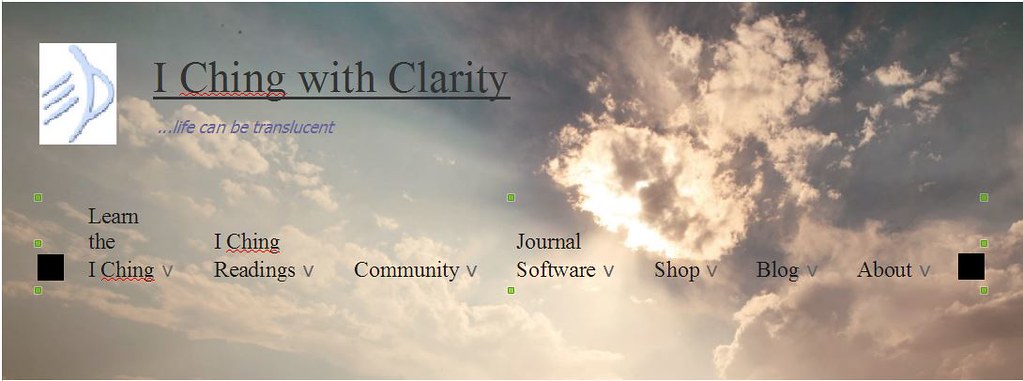
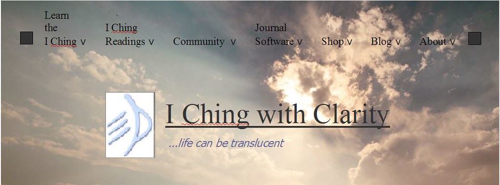
Making the main menu more visible is definitely on the list of things to do (after returning from a holiday ;) ). I'm not super-keen on the idea of putting it in a semi-transparent box because it would make the header look a bit like a giant pillar box. (Mail box, for Americans.) At least I think it would. If any tremendously kind person wanted to experiment making graphic mock-ups of a header with a more visible menu I would not complain at all.

But yes I do feel weird nitpicking. I really do very much like the new site.

Whatever Hilary wants to do is fine.
 

Trojina

Supporter
Clarity Supporter
Joined
May 29, 2006
Messages
27,020
Reaction score
4,514
Oh I hadn't seen that, sorry Lisa. :blush: I'm sure she will appreciate your experiments.
 

Liselle

Supporter
Clarity Supporter
Joined
Sep 20, 1970
Messages
13,003
Reaction score
2,441
It's fine, Trojina :hug:. And she may not, and that's fine, too.
 

Liselle

Supporter
Clarity Supporter
Joined
Sep 20, 1970
Messages
13,003
Reaction score
2,441
Actually...now that I'm looking at this again - there's a huge problem with what I posted. :duh:

There has to be room for the menu expansions to fit on laptop screens without spilling off the bottom and being inaccessible. (Say, like my own laptop screen, for example.)

So clearly the menus can't be all the way at the bottom of the photo. I don't know if moving them up a bit, like this, would help enough?

28043433673_cfc4c988c6_b.jpg


Or maybe something like either of these ("Your account" and "Log out" could maybe go in the lower right or lower left corner) - ?

28044805483_79b8b1823a_b.jpg


28044804803_a50731060a_b.jpg
 
Last edited:

buzzurro

Supporter
Clarity Supporter
Joined
Jan 7, 2008
Messages
106
Reaction score
0
Actually...now that I'm looking at this again - there's a huge problem with what I posted. :duh:
Not really, as far as I can tell this turned out to be no problem at all!

I've taken all these screenshots in a non-maximized Firefox window, 1096 pixels wide (inner width seems to be 1064 pixels).

This is the real header of this site. As you can see the search icon on the right doesn't fit in the window and ends up below the menu:

menu-real.jpg

This is my local tweaked version of a page from this site.
I enlarged the font of the menu headings from 18 to 20 pixels, word-wrapped the text where needed, aligned it at center and moved the down arrow symbols below the headings.
I also enlarged the home icon on the left.

clarity-menu.jpg

Now, this is the expanded "Learn the I Ching" menu from the real site:

expanded2.jpg

And this is my tweaked version of the same expanded menu:

expanded1.jpg

As you can see the > symbols are below the headings instead of on their right. This is not intended, it's a side effect of the way I tweaked the menu, but it can be corrected.
The interesting fact is that it doesn't reach lower than the original one, it's still entirely visible in the page without scrolling.
 

Liselle

Supporter
Clarity Supporter
Joined
Sep 20, 1970
Messages
13,003
Reaction score
2,441
Yes, but in your last sample the headings are only the tiniest smidge lower than they are now. Open expanded2.jpg and expanded1.jpg in adjacent browser tabs, look for a landmark in the clouds, and flip back and forth between them.

In the version of mine that I said had the huge problem, I had put the menus at the very bottom of the photo. There couldn't possibly be enough space that way for the expansions, at least on my 14" laptop screen. There's about an inch to spare currently, with the menu that drops down the farthest (the Resonance Journal one).
 
S

svenrus

Guest
The "Search" menu don't work for me. I normally use Google Chrome browser - could it be the reason ?
Or - is it on it's way to work by time ?
I actually used the Search menu often so: a bit frustrating.....
 

Liselle

Supporter
Clarity Supporter
Joined
Sep 20, 1970
Messages
13,003
Reaction score
2,441
Could you explain a little more how it doesn't work? What you were trying to do, what happened instead, things like that?

I just tried every search feature I know about in Chrome, and they all worked. So a little more information about what's going wrong for you would be very helpful.
 
S

svenrus

Guest
Hey Lisa, Today I reanstalled Google Chrome to be sure to have the newest update and some of the Search-functions work now but still one don't:
I search for a User (myself) and this is what happens:

SearchI.jpg

SearchII.jpg

And I'm sure to have typed the Exact Username....
 

Liselle

Supporter
Clarity Supporter
Joined
Sep 20, 1970
Messages
13,003
Reaction score
2,441
Svenrus, I think the way to fix this is to check off different boxes in Search Types. In your screen clip, you had checked off "Forums."

What works is to check off none of the boxes

all-unchecked.jpg


- all of the boxes

all-checked.jpg


- or only the "Posts" box

posts-checked.jpg .


The results look like this -

svenrus-results.JPG


You'll notice there's only one search result, though. See posts #39 and #40 in this thread, where Hilary explained that.

However, for some reason you do seem to get slightly more results by clicking on your username in one of your actual posts, rather than using the forum search page:

click-username.JPG


As best I can tell, none of this has anything to do with Chrome.
 
S

svenrus

Guest
Thank's Lisa,

I'll try.....


Time is a strange room.... Or ?
 

hilary

Administrator
Joined
Apr 8, 1970
Messages
19,239
Reaction score
3,491
Wow - thank you for all the menu design efforts! I will look at them, I promise... but possibly not for a little bit, because I've heard there's this ancient Chinese oracle thing that some people find quite interesting as an alternative to thinking about web design 24/7 and I thought I might give it a try...

But please know you are appreciated!
 

Trojina

Supporter
Clarity Supporter
Joined
May 29, 2006
Messages
27,020
Reaction score
4,514
I can no longer use the forum at all with internet explorer. I cannot post and get a message saying I am not permitted to anyway ! I told Hilary about this and she said to clear cache which i have done and nothing happens. I don't want to have to make Chrome my browser just because of this forum, it's a right nuisance. I have everything set up for IE why can't I use this forum in IE ? :hissy:

Is anyone else having this problem ?
 
S

svenrus

Guest
On my old WinVista-version I got IE 9 as standardbrowser. Side by side I got Google Chrome and also Mozilla Firefox (just neglecting their offers to be standardbrowsers) and when IE can't handle it I open in Chrome and when Chrome can't, open in Firefox. But, anyway, this seems to be the tendency, that developers have to leave the old browsersystems to follow the mainstream.... (Expensive ?)
 

Liselle

Supporter
Clarity Supporter
Joined
Sep 20, 1970
Messages
13,003
Reaction score
2,441
But - the font in the post quote boxes, not as lovely. IMO it's too small...

Hilary, did you change this? Unless once again my own eyes/brain/memory are being :freak:. I'll take a risk anyway and say it looks ever so lovely now, and thank you :).

(If you changed it a week ago, see comment about eyes/brain/memory...)
 

hilary

Administrator
Joined
Apr 8, 1970
Messages
19,239
Reaction score
3,491
I honestly can't for the life of me remember if I changed it or not, speaking of :freak:. I'll take credit anyway.
 

Liselle

Supporter
Clarity Supporter
Joined
Sep 20, 1970
Messages
13,003
Reaction score
2,441
There are even unintended (probably) and unexpected benefits of the new design! :D

To wit, I now know exactly what to click in the menus to find a trigram/hexagram reference chart. I have used this several times already. (You know, when getting the book with it in would require standing up from the sofa.)
 

Clarity,
Office 17622,
PO Box 6945,
London.
W1A 6US
United Kingdom

Phone/ Voicemail:
+44 (0)20 3287 3053 (UK)
+1 (561) 459-4758 (US).

Top